I Built aristotle.me in 6 Hours. Here's Every Mistake I Made.
I almost shipped an XSS vulnerability on day one. Here's every decision, mistake, and deleted feature from building aristotle.me with Claude Code.
I almost shipped a security vulnerability on day one.
The comment system worked. Threaded replies, real-time loading, Cloudflare D1 for storage. Everything looked great. Then I realized I was injecting user input straight into innerHTML without escaping it.
If someone typed <script>alert('hi')</script> as their name, it would execute. Classic XSS. On a brand new site. Built with AI.
That's the kind of stuff you don't see in "I built this in 6 hours" posts. So I'm going to show you all of it. The decisions, the mistakes, the things I built and then deleted.
Here's how aristotle.me actually came together.
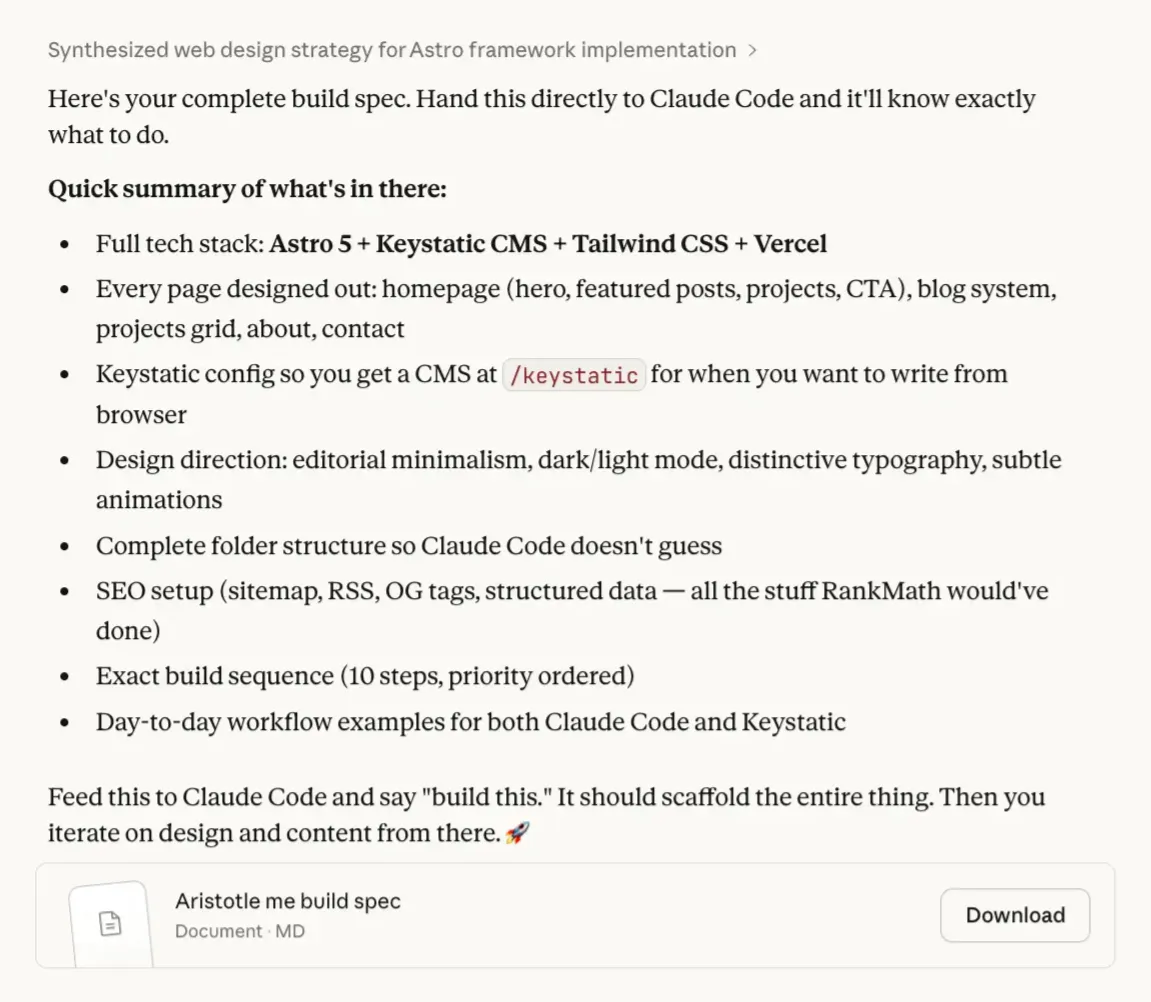
The Spec Came Before the Code
I wrote about why I left WordPress in a separate post. Short version: I use Claude Code every day but never touched my WordPress dashboard. So I rebuilt the whole site in a stack I can manage from my terminal.
But I didn't just open my editor and start typing. I started in Claude's conversation UI (not Claude Code) and talked through everything first. What pages I need. What the content schemas should look like. Design direction. Deployment config.
By the end of that conversation, I had a full product spec.
Then I took that spec into Claude Code, ran it in plan mode, and let it scaffold the entire project. Astro setup, Keystatic config, pages, components, SEO, Cloudflare deployment. All from one spec.
From there, I iterated. That's where the real work started.
Git Init First. Always.
If you're building with AI tools, this habit will save you.
Initialize a git repo the moment the project exists. Commit after every meaningful change. Not at the end. Not when it's "ready." From the very first scaffold.
Two reasons.
Context. Claude Code reads your git history. When it sees what you've already built, what files changed, what the commit messages say, it makes better decisions about what to do next. Your commit history is basically a conversation log between you and your project.
Rollback. Claude Code makes a change that breaks something? You're one git checkout away from the last working state. No panic. No guessing. Just revert and try again.
I committed locally after every feature, every fix, every refactor. Not to push anywhere. Just to save my progress. It costs nothing and it's saved me more than once.
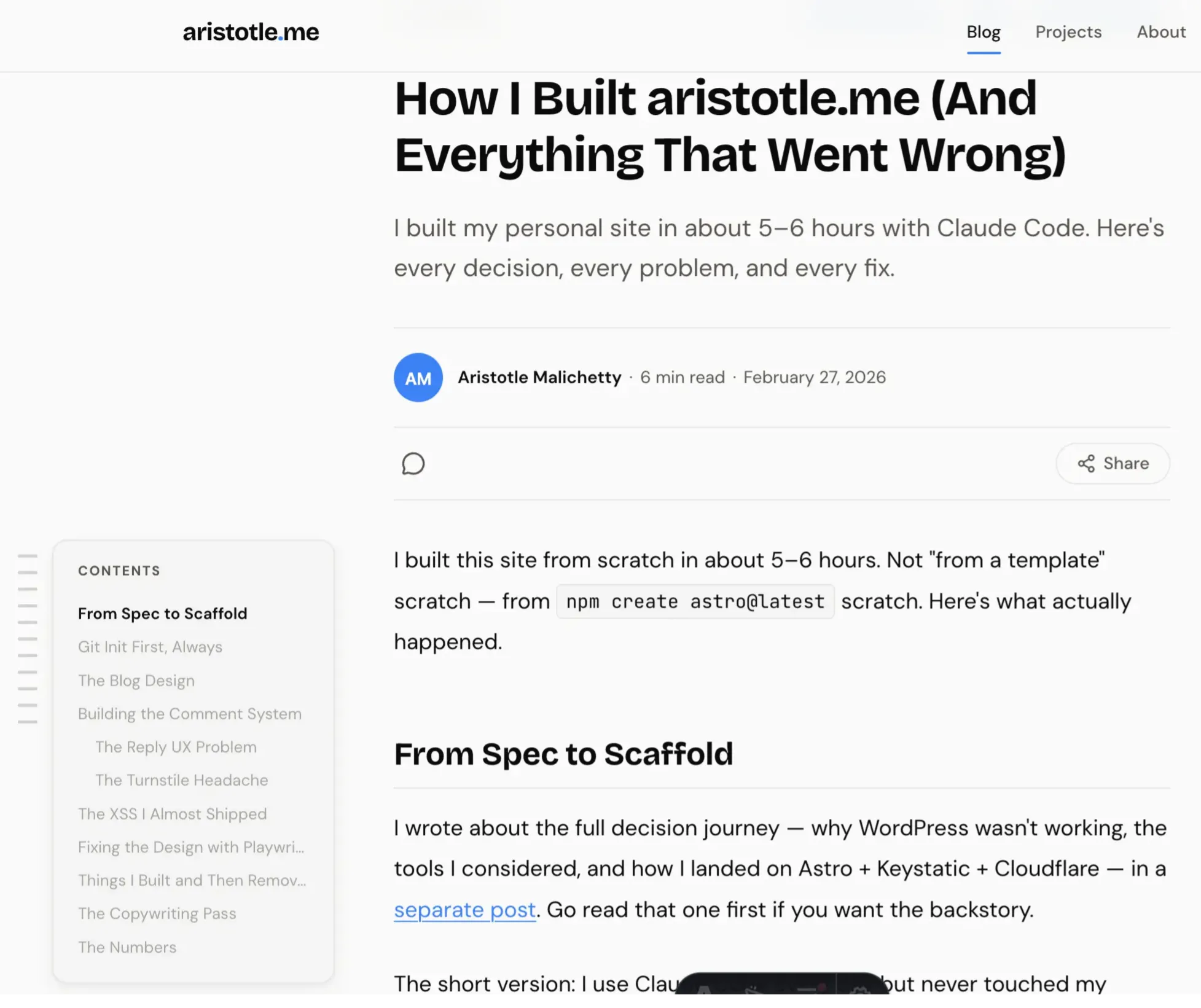
I Basically Copied Substack's Blog Layout
I wanted the blog to feel premium. Clean. Like reading something on Substack or Medium. Not a developer's default markdown page.
So I studied how Substack does it. Reading time at the top, comment count, share buttons. I took that structure and ran with it. Time to read, share icons (almost straight from Substack), and a table of contents on the side that scrolls with you and collapses when you click it.
My site:
Substack:
The goal: make it feel like a real blog. Not a side project.
The Mobile TOC Problem
Desktop TOC works great. Sticky sidebar, collapse toggle, active section highlighting. But it only shows at 1280px and above. On mobile, you just scroll. For a post with 15 sections, that's a lot of blind scrolling.
I added a floating button in the bottom-right corner. Tap it, a bottom sheet opens with the full section list. Tap a section, it smooth scrolls there, sheet closes.
The same IntersectionObserver that drives the desktop TOC drives the mobile one. Both use the same data-toc-link attributes. One observer, two UIs.
Here's the annoying part. I'd set overflow-x: clip on html earlier to stop the desktop TOC from causing horizontal scroll. But clip on html also clips position: fixed elements. So the floating button was half-visible, cut off at the edge.
Moving overflow-x: clip to body fixed it. Small CSS bug. Took way too long to find.
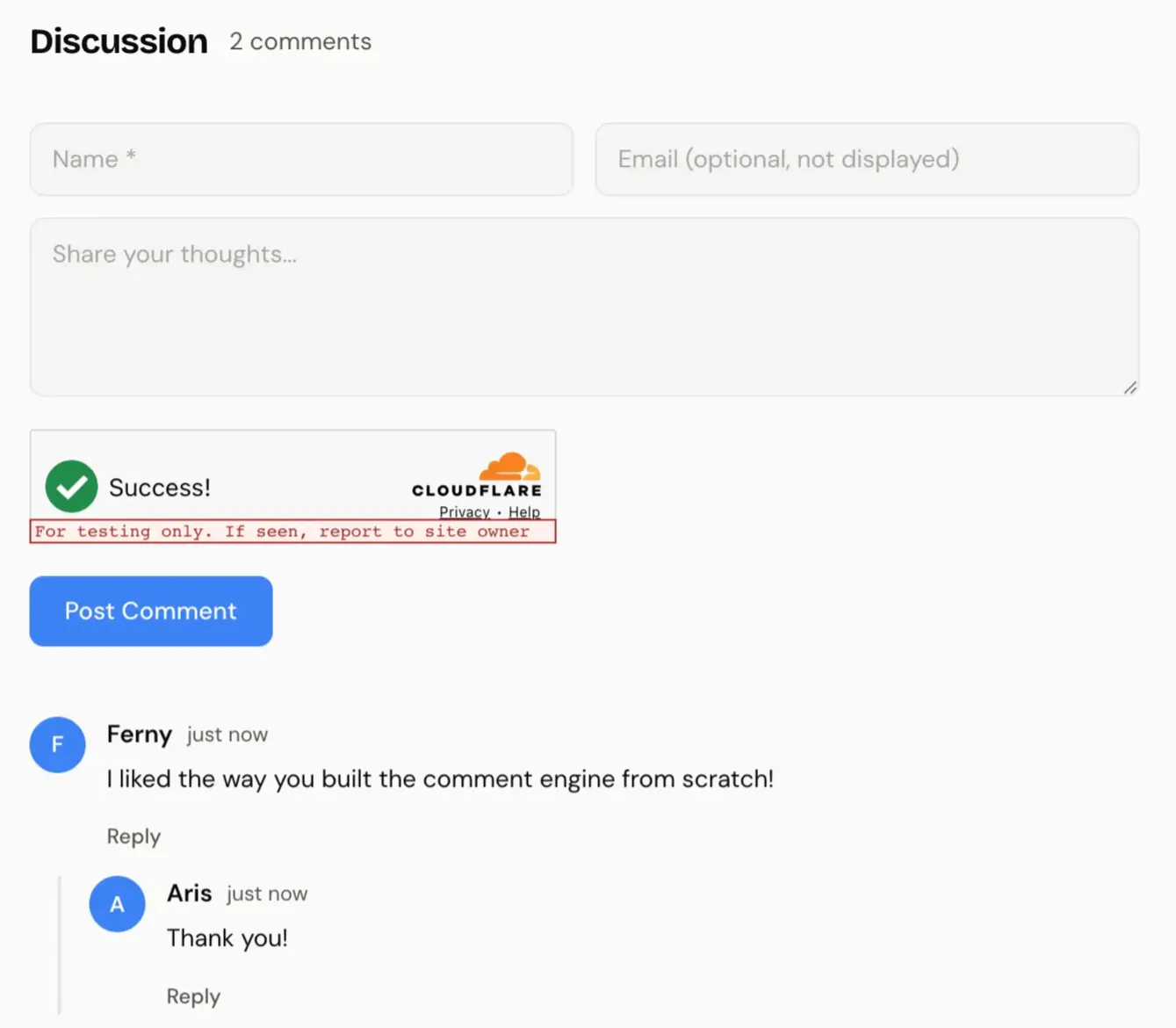
Building My Own Comment System
I wanted comments. Claude Code gave me three options.
Giscus. Powered by GitHub Discussions. Free, open source. But readers need a GitHub account to comment. Most of my visitors aren't developers. Too much friction. Rejected immediately.
Cusdis. Lightweight, open source. I tried to check out their site and it wouldn't even load. Probably my ad blocker. Not a great sign for a tool I'd depend on.
Build my own. Cloudflare D1 (SQLite) + Workers. Full control.
I'd already used D1 on other projects, so I knew how it worked. And Cloudflare's Turnstile (their free invisible CAPTCHA) handles bot protection well. So I built my own.
The setup: D1 for storage, Turnstile for spam protection, honeypot fields that bots fill out and humans never see. Plus rate limiting at 5 comments per 10 minutes per IP, content-based spam filtering, and threaded replies.
The Reply UX I Got Wrong
First version: you click "Reply" on a comment, it scrolls you all the way back up to the main form at the top. Shows "Replying to [name]" but now you're at the top of the page. Away from the conversation you were reading.
Bad UX.
I rebuilt it. Now clicking "Reply" opens an inline form right below that comment. Name field, text field, submit button. You stay in context. You can see what you're replying to.
Much better.
Two Turnstile Widgets on One Page
Each comment form needs its own Turnstile widget. The main form has one. When someone clicks "Reply," a second widget renders in the inline reply form.
Managing two Turnstile instances on the same page was more annoying than building the comment storage itself. Initializing them, resetting after submission, cleaning up when the reply form closes. It works. But it was the most frustrating part of the entire build.
The XSS I Almost Shipped
I mentioned this at the top. Here's the full story.
The comment form takes a name and a message. I was putting that text directly into the page without cleaning it first. No filtering. So if someone types actual code instead of their name, the browser doesn't know the difference. It treats it as part of the website and runs it.
For a random visitor reading my blog, the damage is limited. They don't have accounts on my site. No login sessions. But someone could still redirect them to a phishing page, inject fake content, or run a crypto miner in their browser.
The real risk was me. I use Keystatic with GitHub OAuth to manage this site. If I'm logged in and view a malicious comment, that script runs in my browser with my auth tokens. Someone could grab my GitHub token, push code to my repo, and since Cloudflare auto-deploys from GitHub, they'd own my entire site. Through my own comment section.
The fix took two minutes. A small function that converts special characters into safe text before displaying them. Applied it everywhere user content touches the page.
But here's the lesson. When you build with AI, the code comes fast. Really fast. It's easy to trust it because it "works." You still have to check what happens when real people type things you didn't expect. AI tools are fast. They're not infallible.
The Design Was Ugly (Until Playwright MCP Fixed It)
After building everything, I installed Playwright MCP into my Claude Code workflow. This lets Claude Code actually see the UI in a real browser. Not just the code. The actual rendered page.
I told it to go through the whole site and tell me what could be improved.
The initial design was plain. Functional but bland. Claude Code came back with suggestions. Warmer color palette, better card elevations, the white-and-cement color pattern you see now. The site looked significantly better after that one pass.
I also pulled two recommendations from LinkedIn and added them as testimonials. The original reviews were long. Nobody reads a full paragraph from a stranger. So I trimmed them to the strongest two sentences each.
Things I Built and Then Deleted
The resume page. Built a full resume page, then killed it. Every job wants a customized resume now. A generic one on your website doesn't help anyone. LinkedIn already does that job. I replaced it with an About section instead.
The pre-commit hook. I was worried about accidentally publishing draft blog posts. So I built a git hook that scans staged files for draft: true and blocks the commit.
Then I realized the code already filters out drafts. They never show on the live site regardless. And if I ever use Keystatic from a browser, drafts need to be in the repo for the CMS to see them. The hook would break that.
Removed it two commits later.
Both times, the right move was deleting what I just built. That's harder than it sounds.
The Words Mattered More Than the Code
This surprised me. After the whole build was done, I asked Claude Code to review the copy across the site. Not the code. The words.
My homepage hero said: "I do marketing, analytics, AI, automation, and product dev. Basically anything that lets me avoid a boring day."
Meanwhile my About page said: "I see how things should work. Then I build them."
See the gap?
The About page was carrying the whole site. The homepage, the first thing anyone reads, sounded like a LinkedIn headline.
I rewrote everything in one pass. Trimmed testimonials. De-duplicated taglines. Tightened every description.
Zero code changed. More impact than any technical feature I shipped.
3.1MB of Images on a "Fast" Site
After publishing, I opened DevTools. Checked the network tab.
The blog images were loading as raw PNGs and JPGs from the public/ folder. No compression. No responsive sizing. No WebP. One screenshot was 1.4MB.
For a site that's supposed to be fast, that's embarrassing.
Astro has a built-in <Image> component that handles WebP conversion, responsive srcset, lazy loading, and layout shift prevention. But it only works on images that go through Vite's build pipeline. They need to live in src/, not public/.
I told Claude Code to fix this. It entered plan mode, read the Astro and Markdoc docs, explored the codebase, and came back with an 8-step plan.
The tricky part wasn't moving files around. It was making Markdoc's image rendering use Astro's <Image> component instead of plain <img> tags. And keeping Keystatic's image uploads working with the right relative paths.
The fix touched eight files. Custom Markdoc image node, Astro component with external URL fallback, updated content schemas, Keystatic config changes, and the blog post template.
Here's what happened to the file sizes:
| Image | Before | After (480w) | After (1024w) | Reduction |
|---|---|---|---|---|
| blog-layout-substack.png | 1,468kB | 18kB | 124kB | 99% |
| blog-layout-aristotle.png | 872kB | 19kB | 94kB | 98% |
| claude-build-spec.jpg | 568kB | 24kB | 71kB | 96% |
| comment-system.png | 264kB | 7kB | 24kB | 97% |
| Total | 3,172kB | 68kB | 313kB |
3.1MB down to 68kB on mobile. That 1.4MB Substack screenshot? 18kB.
The initial build is never done. The best improvements come from actually using your site and noticing what's slow.
SEO You Don't Notice Until It's Missing
After fixing images, I compared my site to what WordPress + Rank Math gives you out of the box.
I was missing a lot. No twitter:creator tag. No article:modified_time. No structured data beyond basic BlogPosting. No breadcrumbs in Google results.
The biggest gap: no social share images. Every time someone shared a post on Twitter or LinkedIn, it showed up as a plain text link. No preview card. No image. Just a URL.
WordPress plugins generate all of this automatically. On a custom stack, you build it yourself.
OG Images That Don't Look Auto-Generated
I didn't want to design a share image every time I publish. So I built a system that generates them at build time. Every post gets a branded 1200x630 PNG automatically.
The tools: satori (the same engine behind Vercel's OG images, converts markup to SVG) and @resvg/resvg-js (SVG to PNG). Both run at build time. They're static files by the time they hit Cloudflare.
First version was bland. Blue rectangle, white text, "AM" circle in the corner. Looked like every other auto-generated OG image on the internet.
So I iterated. Swapped in my pixel art avatar. Added the post description. Unified the branding. Added a gradient. Anchored content to the bottom.
Before:
After:
The difference between "auto-generated" and "intentional" is usually just a few design decisions.
Btw, two things tripped me up here. Resvg uses native Node.js bindings, and Vite's bundler tried to process the .node file during the Cloudflare build. Crashed with "Unexpected character" errors. Fix: add @resvg/resvg-js to vite.ssr.external so Rollup leaves it alone.
Also, satori doesn't support woff2 fonts. Google Fonts serves woff2 by default. I had to fake an old IE User-Agent in the font fetch to get TTF format instead. Weird hack. Works perfectly.
Everything Else I Was Missing
Beyond OG images, I added Twitter meta tags so posts link back to my account, article:modified_time for blog posts, Person and WebSite JSON-LD on the homepage for Knowledge Panels, BreadcrumbList JSON-LD for breadcrumb snippets in search results, and enhanced BlogPosting schema with image, wordCount, and publisher fields. Fixed up the RSS feed with proper author and category info too.
The share modal also got an upgrade. It used to show a gradient placeholder when a post had no cover image. Now it shows the actual generated OG image. What you see in the modal is exactly what people see when they click your link.
None of this changes how the site looks. But it's the difference between a bare URL and a branded card when someone shares your post.
The Numbers
6 hours of build time. Sub-500ms page loads on a global CDN. $0/month hosting. Zero plugins beyond core Astro integrations.
The site is open source: github.com/aristotlem/aristotle-me
The code was the easy part. The hard part was knowing what to say, what to cut, and when to stop tweaking.
I'm working on a few other things right now. Including a UFC Fighter Quiz that matches you to a real fighter based on your fighting style. Five questions, weighted style profiles, live stats from my UFC API. Go find your alter ego.
Written by Aristotle Malichetty
Analytics and code. I build what the problem needs.
Discussion
No comments yet. Be the first to share your thoughts!
Loading comments...